Hi!
I'm Mathieu Renaud, product and design maniac, passionate about entrepreneurship and tech.
I identify user behaviors, design beautiful experiences on any device,
with a business vision. Discover how I work first!I'm vP Brand and Design at Brigad.co at the moment (20M€ raised, backed by 50 Partners and Uber Technologies Inc.), therefore I'm
CURRENTLY UNAVAILABLE 😬
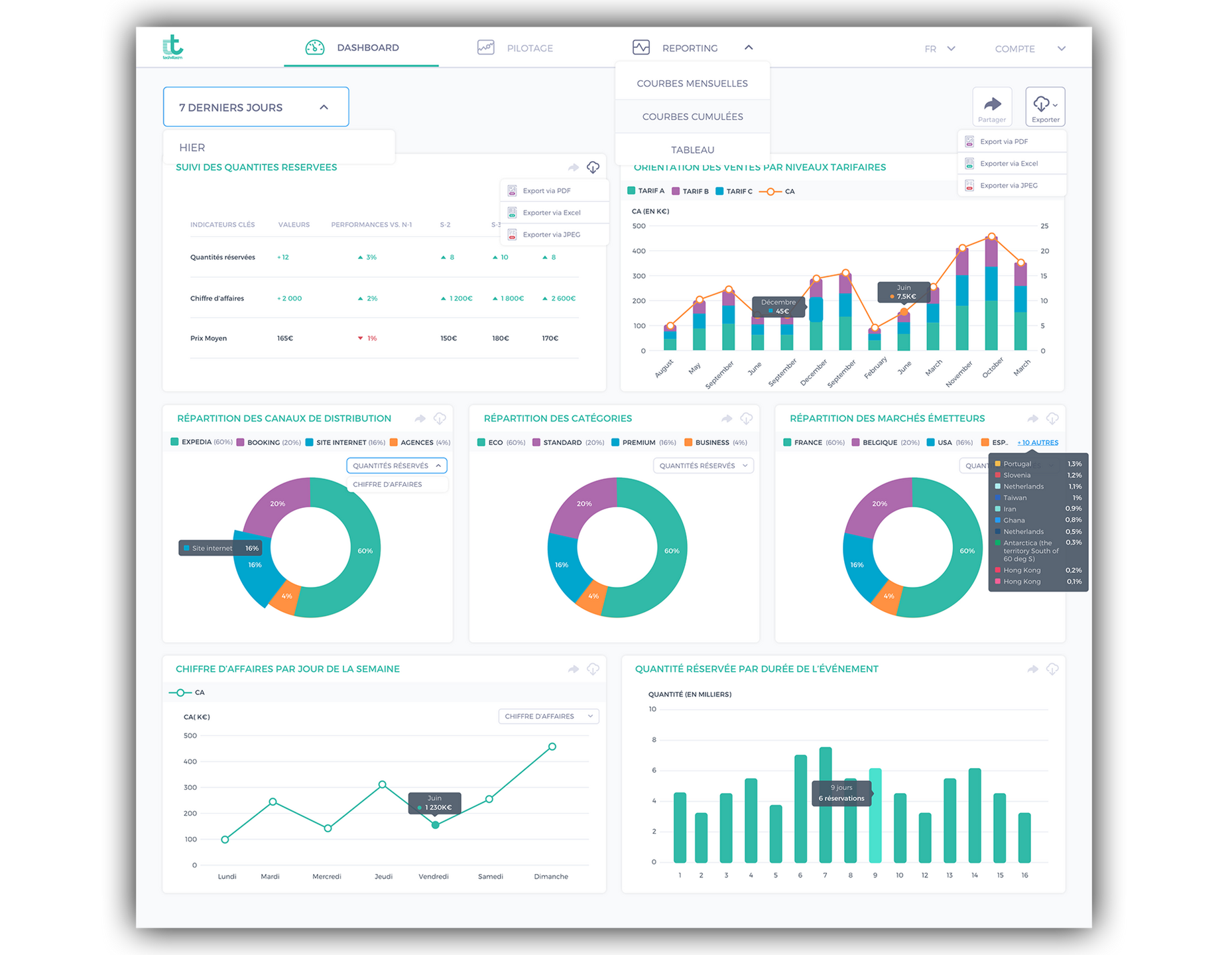
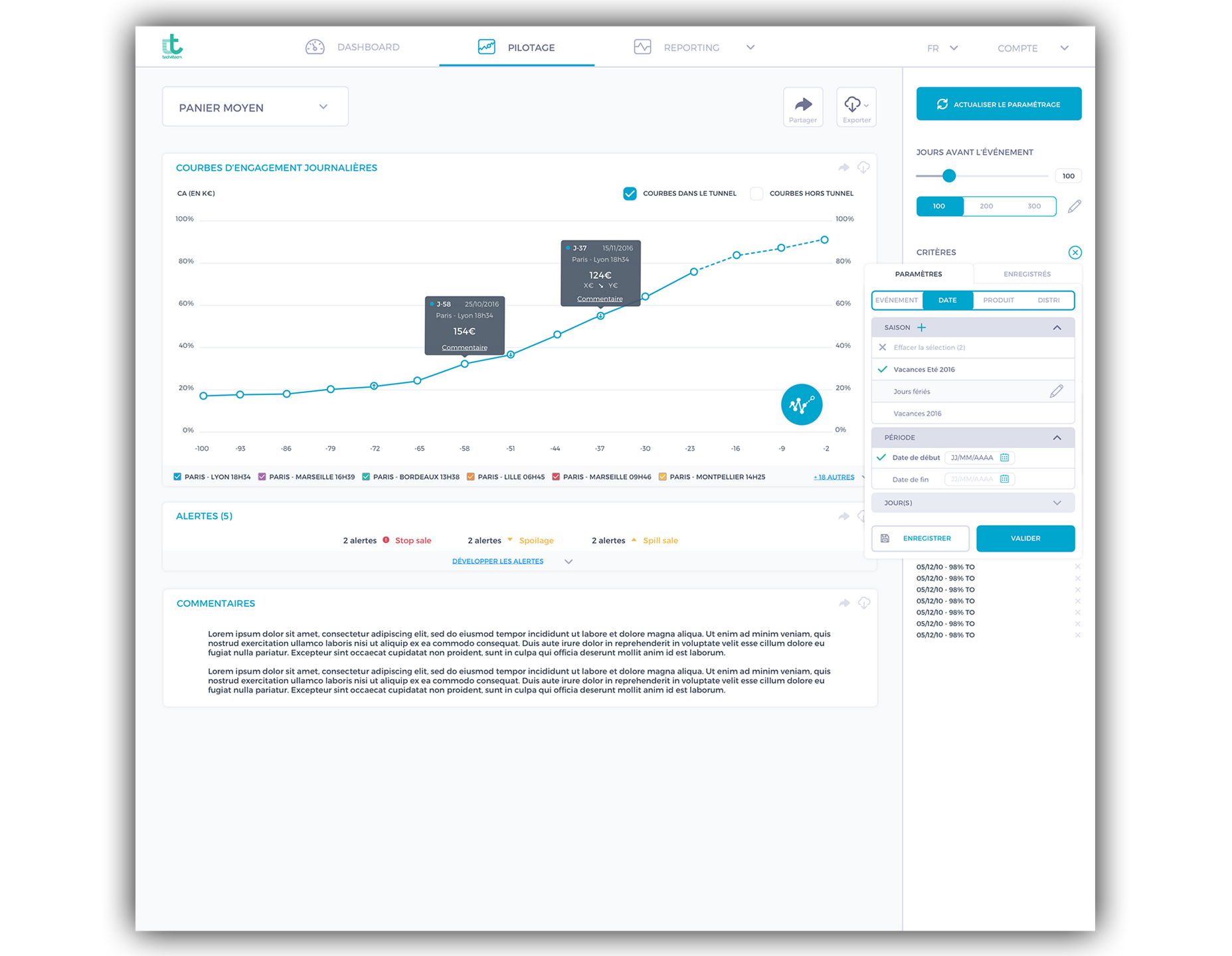
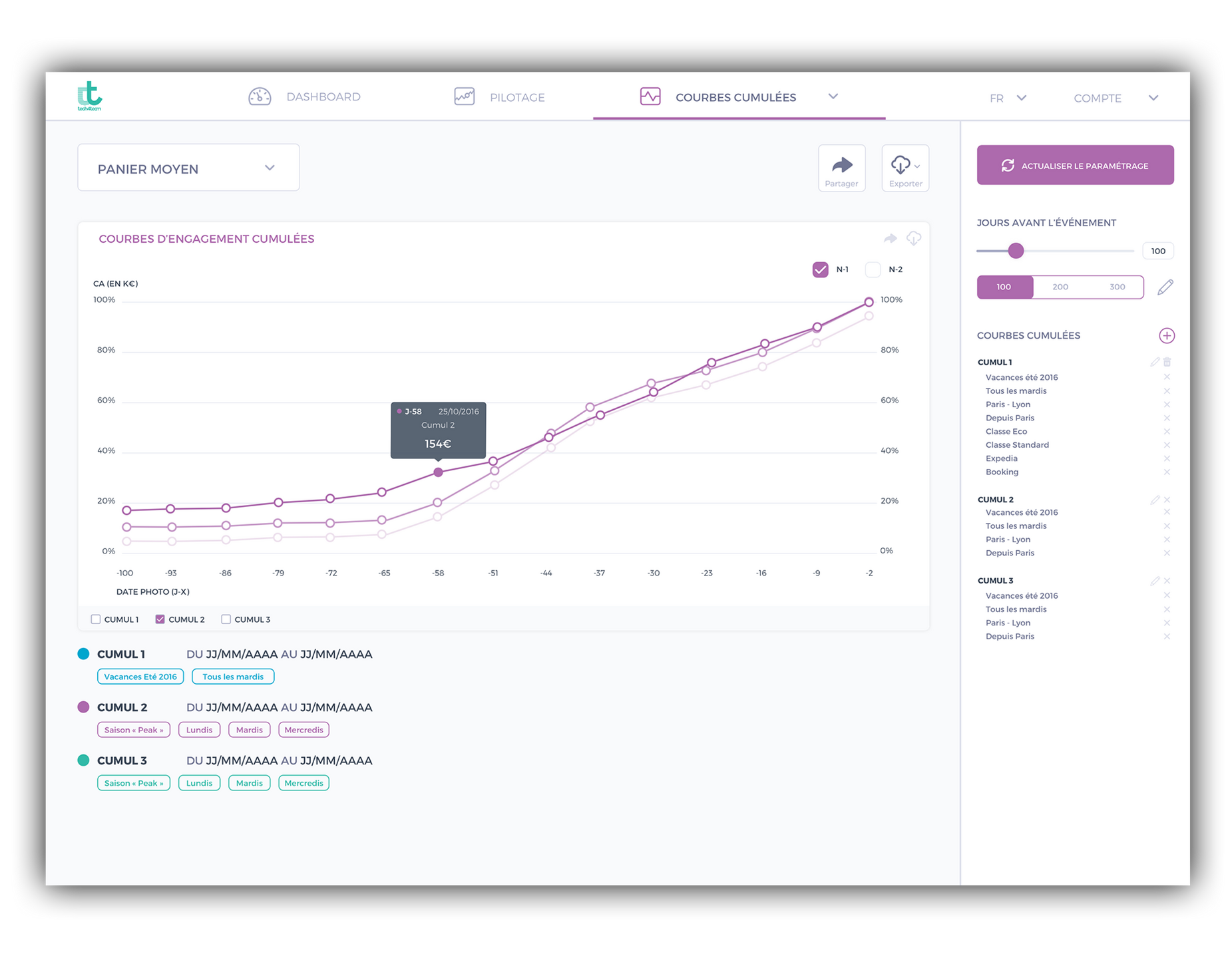
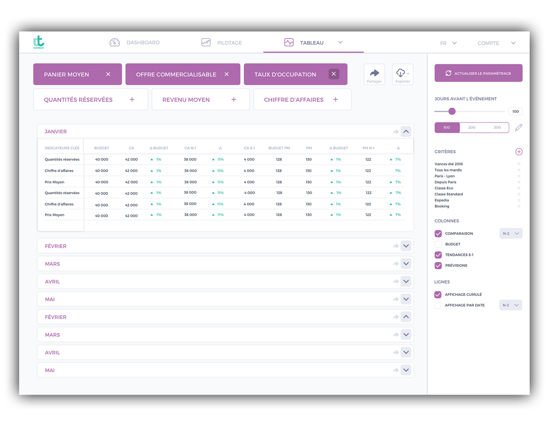
Dashboard ui
This project consisted in designing from scratch a dashboard for a very technical solution of yield management to help managers piloting their pricing strategy.It was realized in 7 full days of work, split in 3 parts: one day for the briefing and the user flows, 2 and a haf days for the wireframing, and 4 days for the design and the production of a high fidelity design.
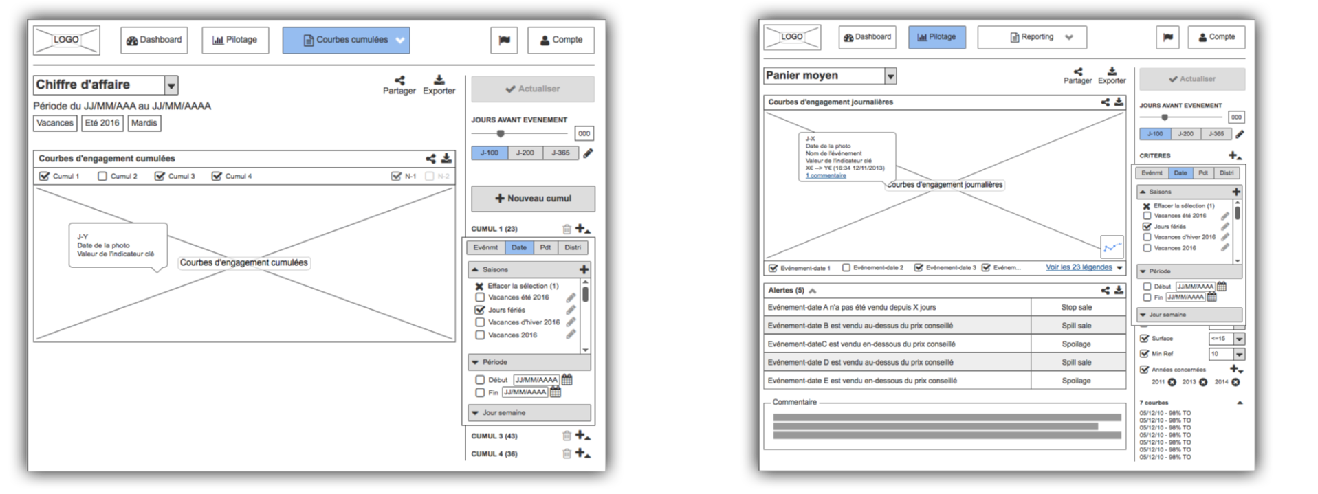
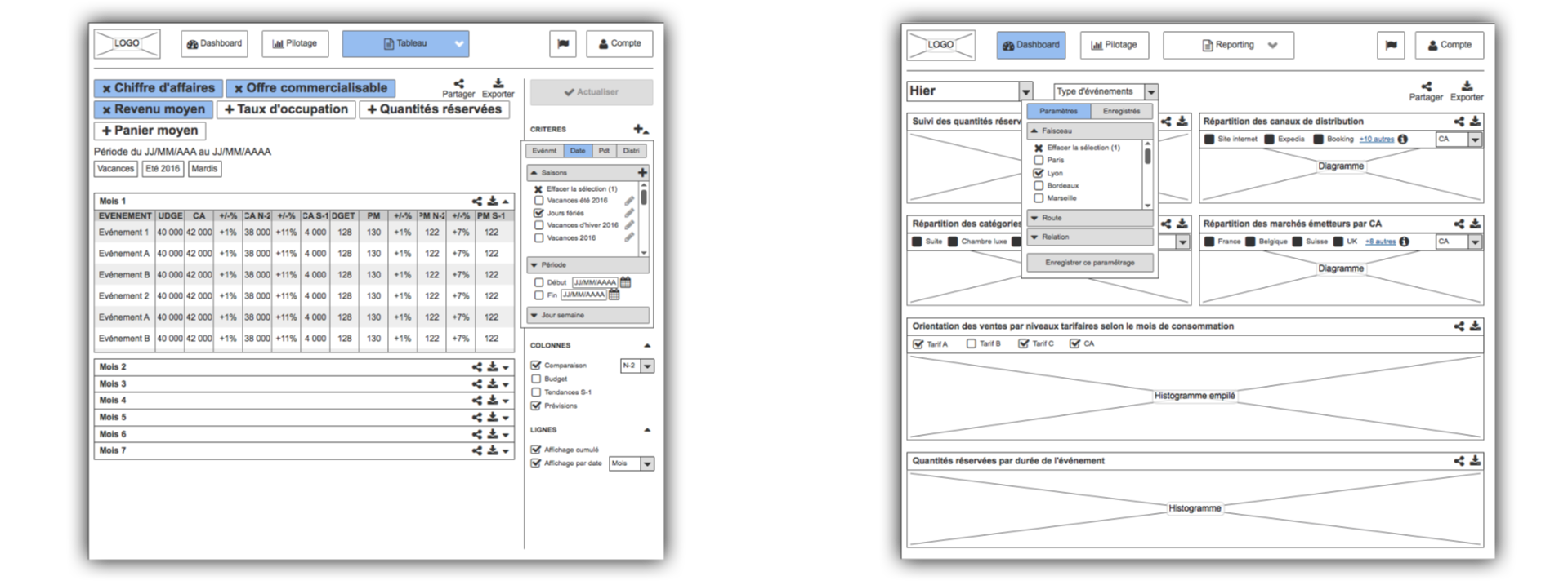
These are just a few selected screens among tens of them. The whole dashboard is structured in 3 parts: Dashboard for immediate short-term action and control, "Pilotage" for real-time pricing strategy, and Reporting for in-depth analysis and taylor-made reports production for managers and their superiors.
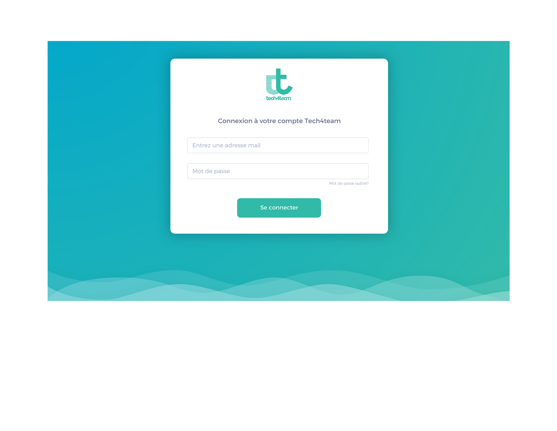
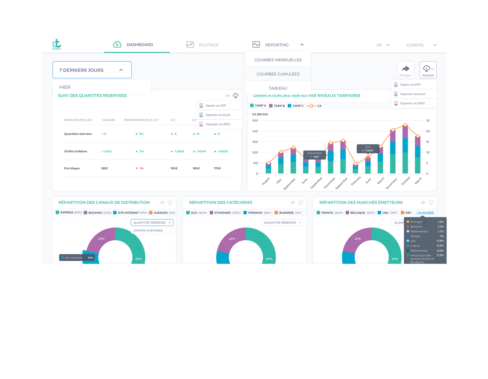
The final prototype was made of 80 screens, with about ten interactions per screen, in order to have the most detailed prototypenot only for the client and the developers, but also to have a very realistic version to test with managers, the end users of the interface.Images below can be clicked to show larger versions.
Let's talk!
Graphic design
Before UX/UI design, I first worked during several years in graphic design, providing visuals for online and offline communication (posters, banners, flyers, roll-ups). Although I made tens of designs, I chose just to present a sample I consider representative, not to overwhelm you with visuals.
Posters
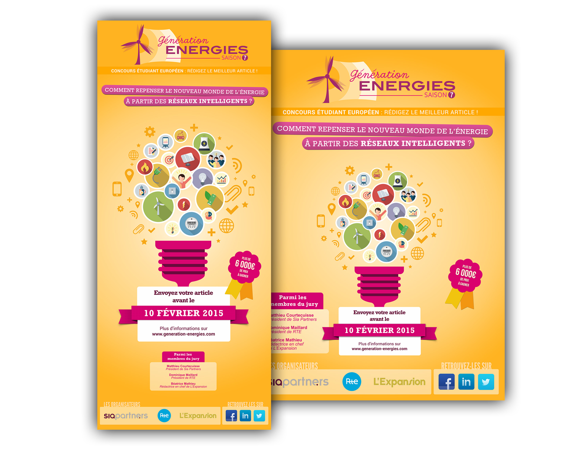
This communication was made for a national competition organized by SIA Partners, one of the leading european management consulting firm. The purpose was to gather the best thinkers and reflexions around the future of smart grids.
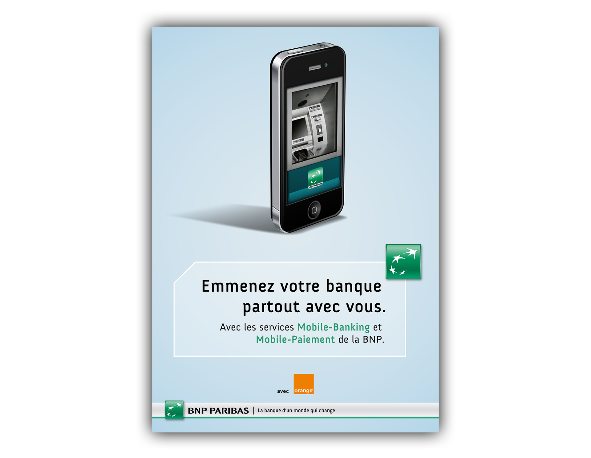
This poster below was realized for an Advertising & Creativity competition. The theme was provided by BNP Paribas, one of the major French banks, and consisted in promoting the future mobile services of the bank.This visual ("Bring your bank anywhere with you") got me the 1st Prize of the competition.
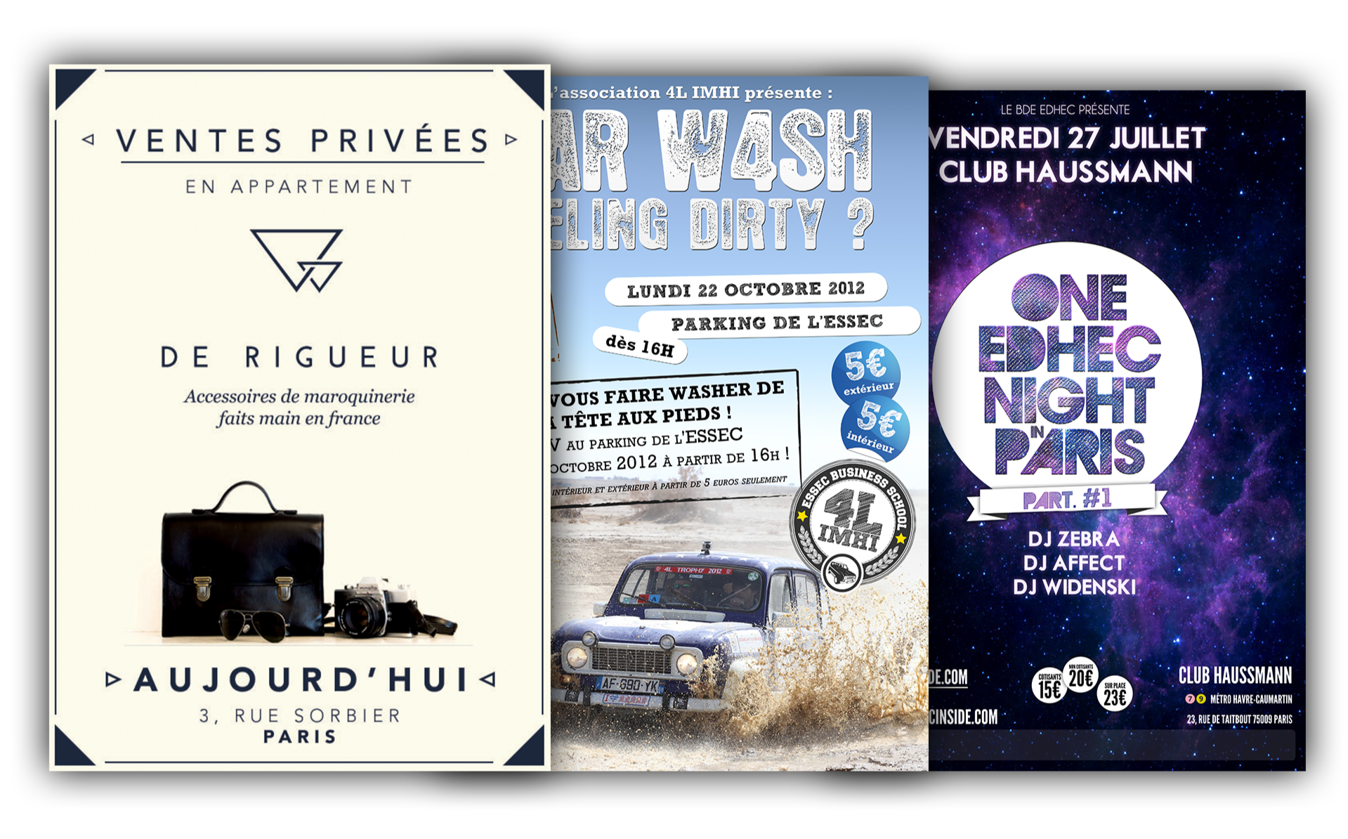
I otherwise realized many posters for startups and associations of the best business schools, for various events that they organized.
Leaflets
Below is the template for a leaflet that was eventually distributed at a worldwide architecture summit.
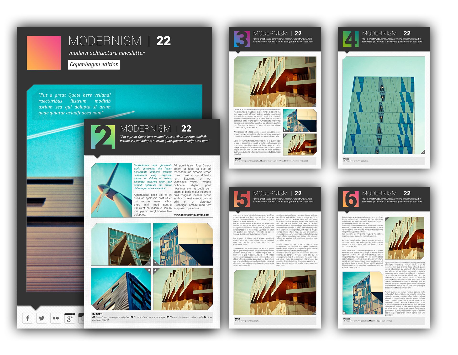
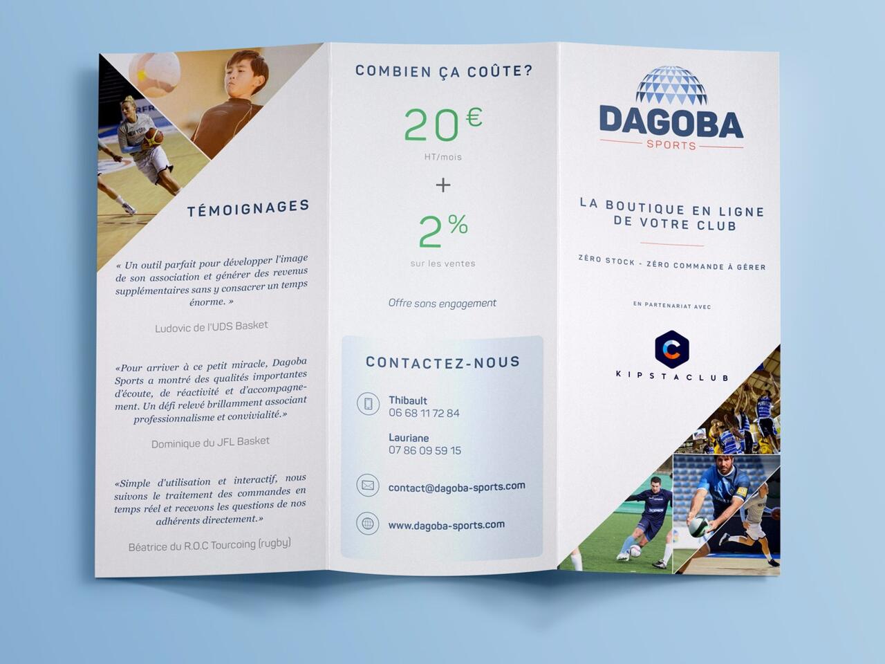
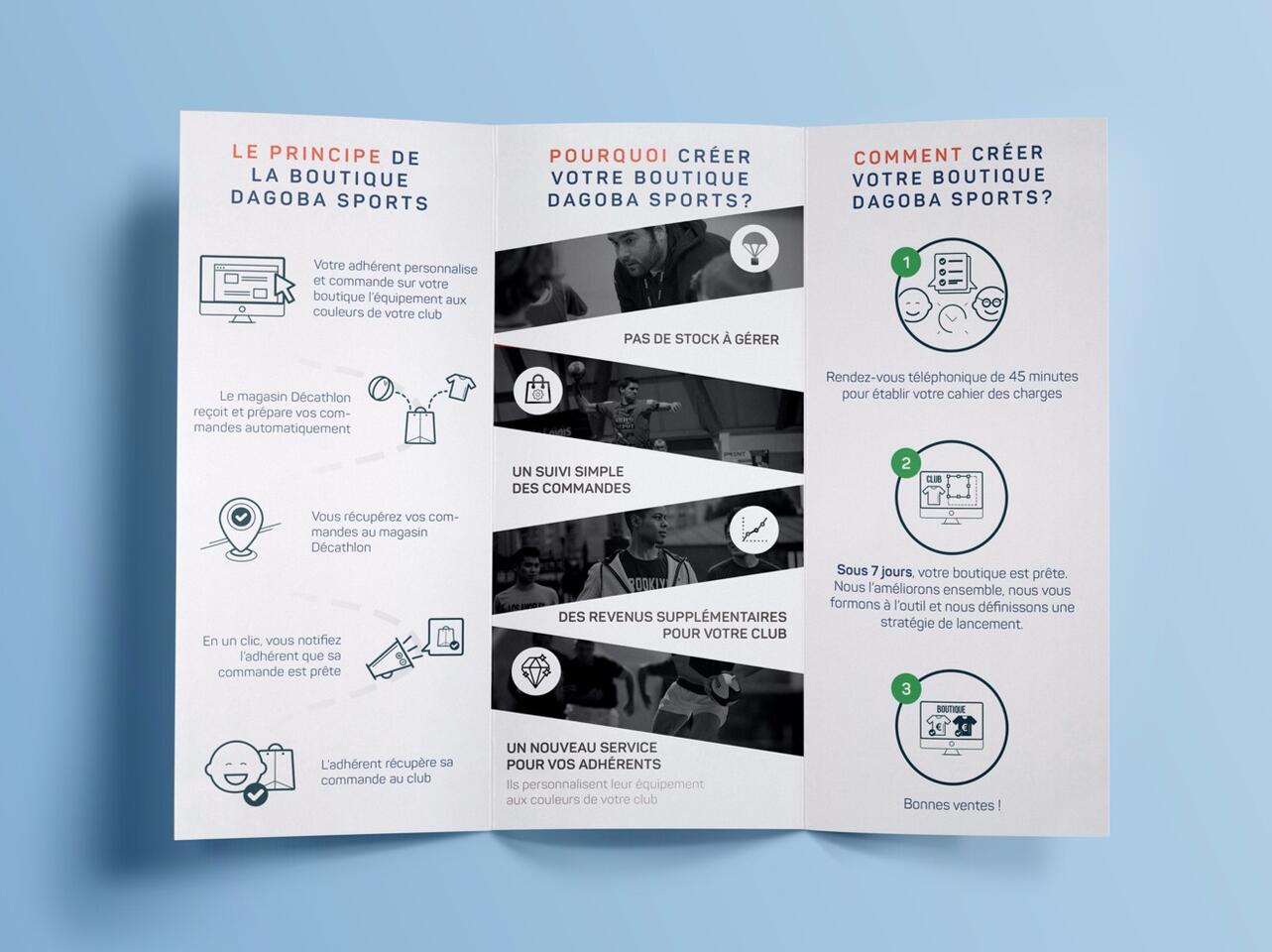
The leaflet below was designed for a startup providing drop-shipping based personalized sport equipments. This aimed at explaining and convincing clients, on the spot, efficiently, this rather technical solution.
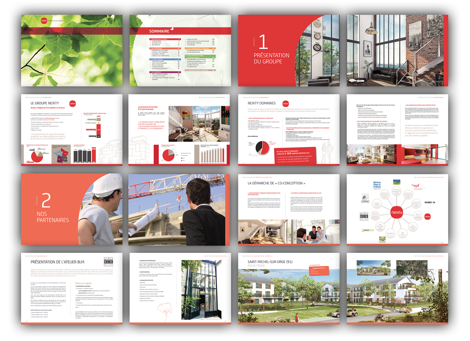
That last leaflet (158 pages in total) was a response to a call for bids by a famous real estate developer. The objective was to convey the values of the companies and its partners, along with a convincing presentation of an ambitious real estate project worth several millions of euros.
Let's talk!
How i work
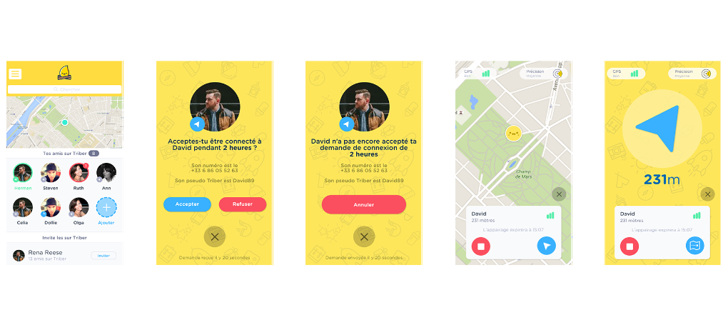
Mobile apps have been my main focus for the last years, but I also design for the web. The method remains the same: formulation of business and users objectives, structure, prototyping and then design. Each step is made of iterations in a lean way.The mobile app Triber will serve as an illustration of my method below.
I. Concept
We first identify together the business objectives (KPIs, ratios to optimize), and the users objectives (through interviews, surveys). From which emerges a structure, or user flows.
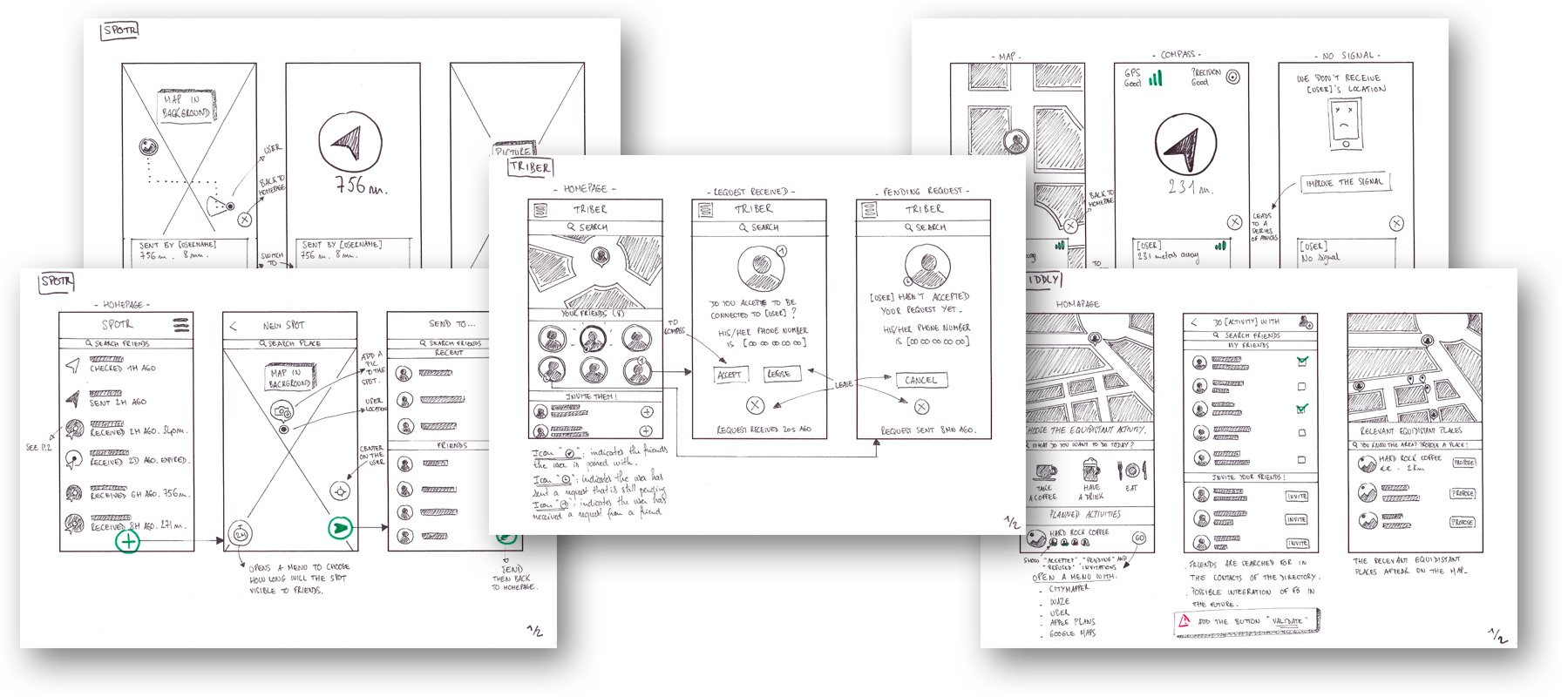
II. Structure
The user flows, that both lead to users' problem resolution and business objectives, then evolve to sketching and wireframing in order to formulate the first interactions.
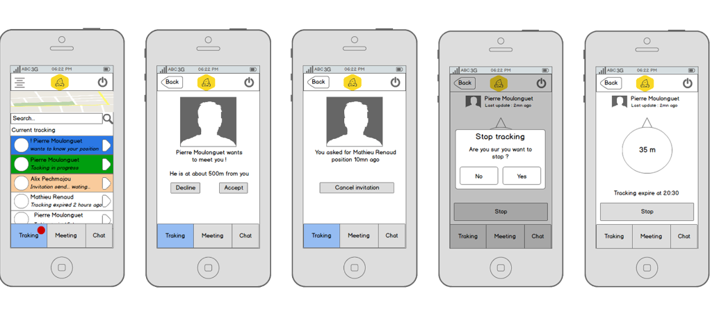
III. Prototype & Design
Once validated through regular feedback loops, the wireframes evolve towards their final design, which are also tested through many iterations thanks to prototyping tools.
Let's talk!
Case study: Middly
The perfect equidistant point to meet with friends
Middly is a mobile app that aims at suggesting the best equidistant place to meet (bar, coffee, restaurant...) with one or more friends, and cut the long conversations to discover which place is the most convenient for everyone.The work began with a long reflexion in order to really determine the pain point with users, and streamline and idea that was at first cluttered with features, incompatible with the concept of MVP (minimum viable product).
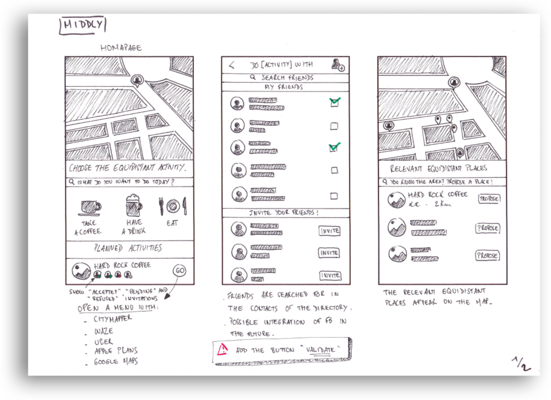
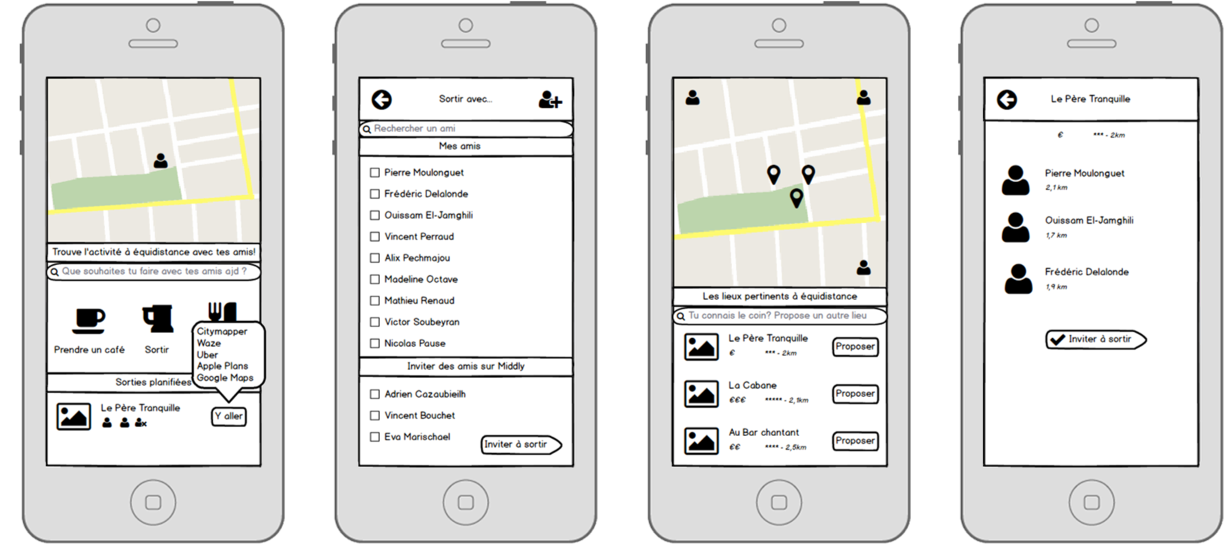
After identifying the real value added of the concept -locate friends, calculate the equidistant point, suggest the most relevant place-, I worked with the team on the most simple and direct user flow and produced wireframes with the objective of being obvious and instantaneous for the users.
Feedbacks being overwhelmingly positive, we decided to work on the final design, still iterating on it by broadcasting regularly prototypes among the most interested users.
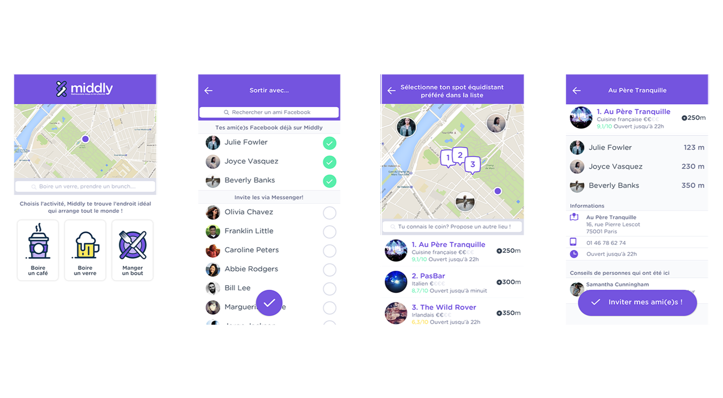
The result is a beautiful and straight-to-the-point MVP that will enable the client to test properly this first version of the app. I also produced a short animation to present the app in 30s. and enable the client to work on the recruitment of beta testers even before the MVP was available.
Let's talk!
Motion design
Motion design is perhaps one my favorite means to prototype, and gives a first glance at a product before it even exists (cf. Dropbox), but I also produce animations for logos or little stories.
Poule House
The objective is to disrupt the egg industry, as surprising as it may sound, there is a lot room for young, ambitious and tech-savvy competition. The objective here was to produce a signature, fun and quirky around the egg and the global scale.
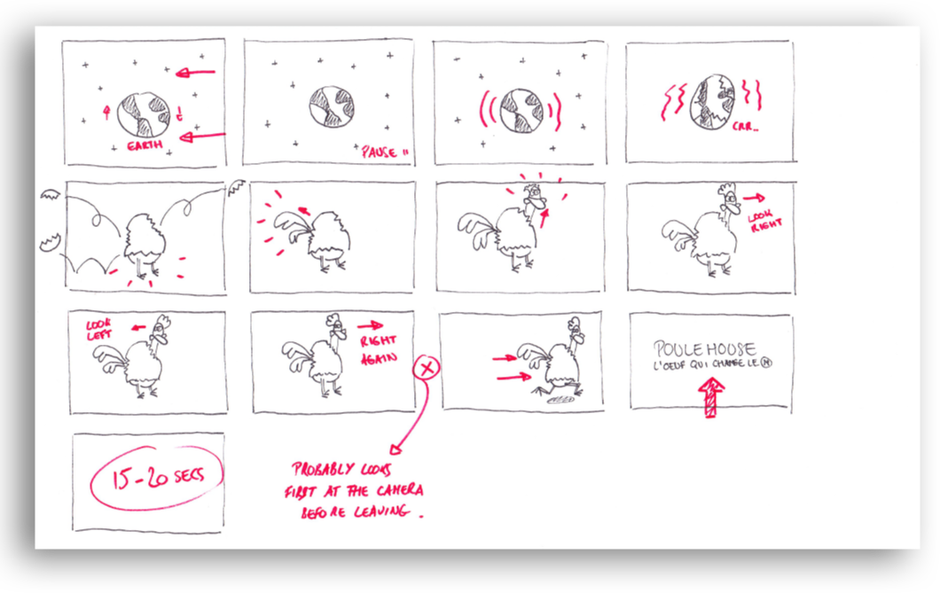
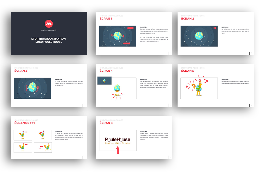
Over the course of only one week, I produced roughs and storyboards, and, once validated, animated the elements to deliver on time the following animation, that the client absolutely loved.
Let's talk!
Brand identity
A logo is the face of a brand or a product, I consider it fundamental in the creative process, both internally (art direction) and externally (values and message reflected), but it's just the tip of the iceberg.
It takes a lot time and trials to carefully craft a brand, in order to convey the right values through any support of a brand, while respecting the standard of an industry or a field.
case study: Blax
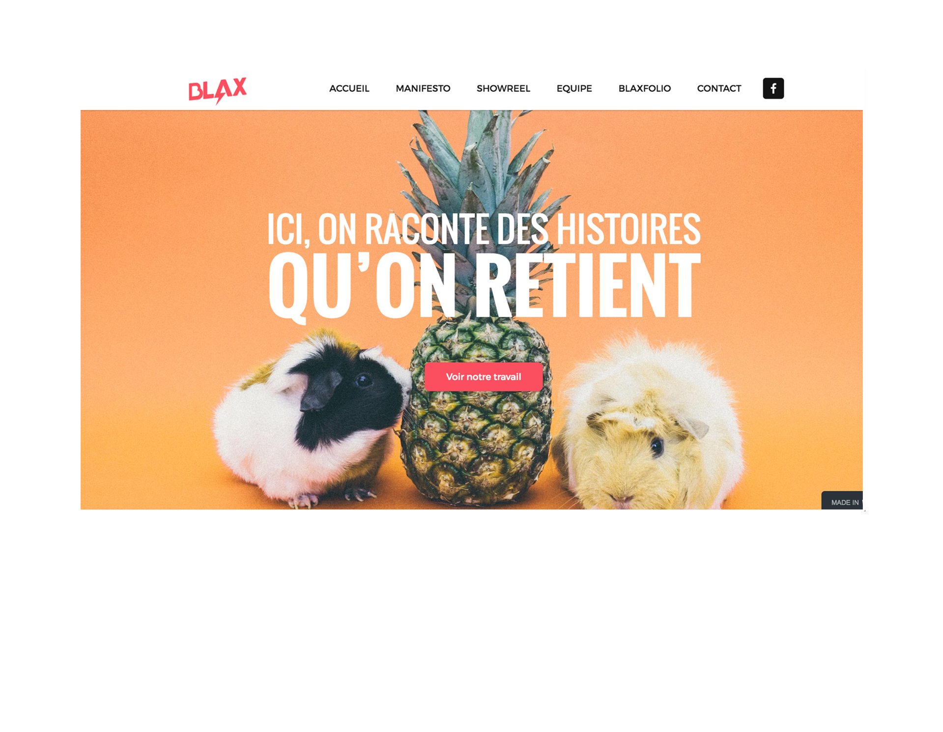
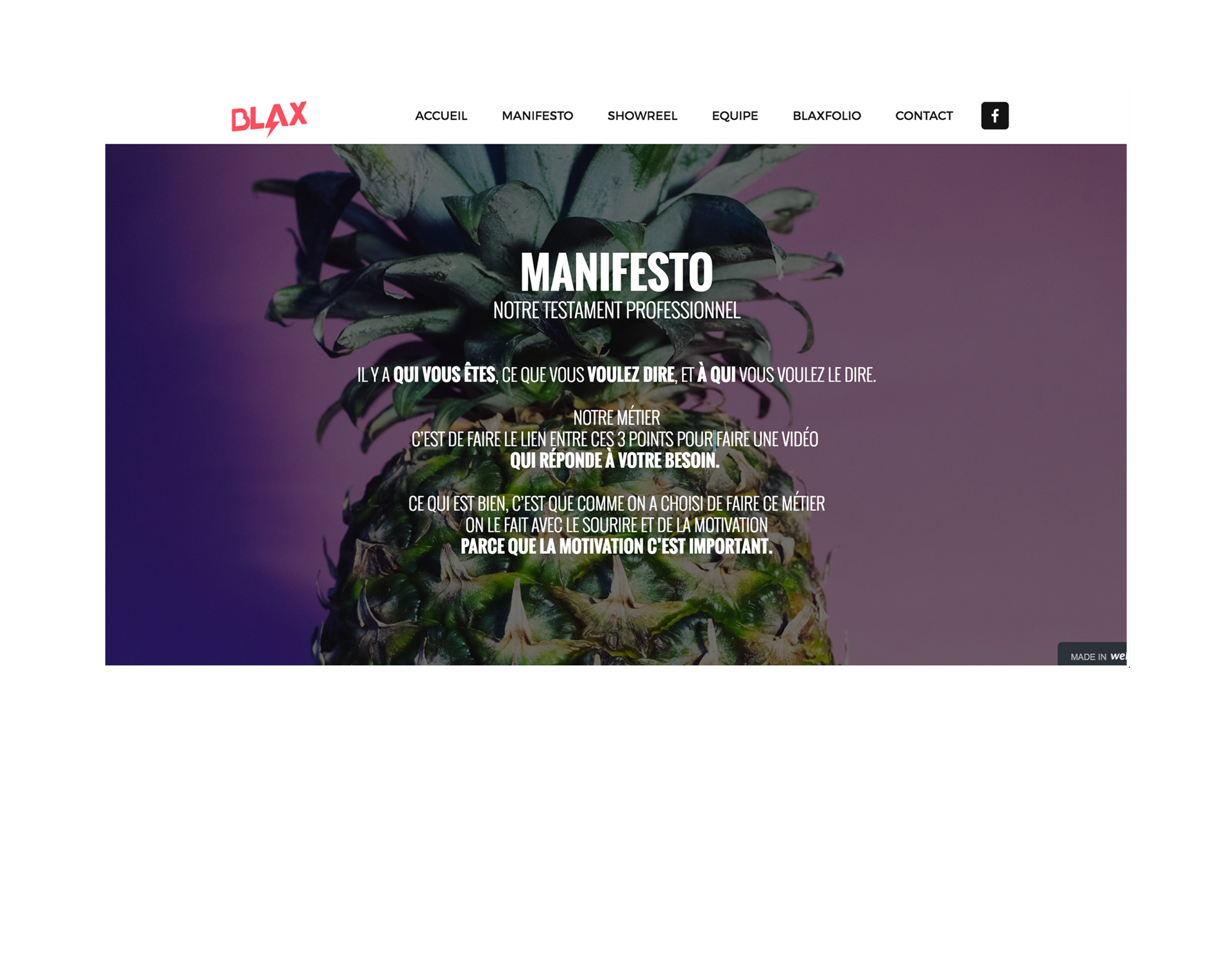
BLAX is a young video production agency, that was looking for a visual identity, quirky but still very professional, forthright and credible, without resembling any other agency.It’s a good illustration of my ability to ruthlessly execute and put my up-to-date design skills to contribution instantly. Indeed, I had two weeks to imagine, prototype, design and put online the visual identity and the website.

After tens of iterations, we decided to move from an impactful but static logo, to a simple, more dynamic and warm one, with a comic-esque aspect. The client was delighted with the final result: a young, modern identity with which his team really identified.
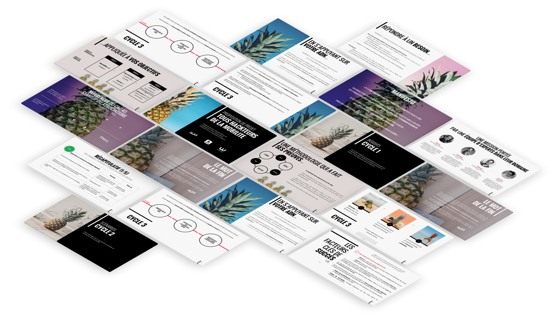
As far as the website is concerned, I developed the colorful and warm atmosphere through a tropical environment and more particularly through the pineapple as an identifying gimmick all along the navigation, to keep the quirky side the client loved, while still sticking to professional standards.
The deadline was very short in particular because of a call for bids that the client wanted to answer absolutely. The art direction had to be developed as well for the proposal and the Powerpoint template.The client eventually won this call for bids.
Let's talk!
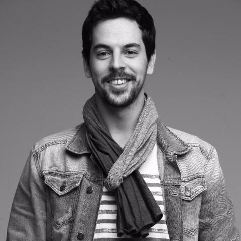
I'm Mathieu Renaud, I accidently discovered tried design in 2011 and never stopped since then ! From graphic design, I evolved to webdesign and eventually UX/UI design.
I've been doing this in freelance and startups for 7 years and was myself CEO/CXO of my startup for 2 years.I graduated from one of the best business schools of Europe (EDHEC) and one of the best design schools (Les Gobelins), which gives me a quite unique hybrid profile: designer with a business vision.UX/UI design maniac, I love solving problems with beautiful designs : I'm convinced that the more brain we use, the less actions the user needs to take. My dream job is CXO (Chief Experience Officer).I love traveling, Marvel, entrepreneurship, startups, photography and learning new things.Follow me and discover more of me:
What I do
| UX/UI design | Motion design |
| App design | Art directing |
| Web design | Prototyping |
| Product design | Sketching |
